DAFFODIL DAY Cancer Council
- RW
- Aug 15, 2018
- 2 min read

Updated: Dec 18, 2018


Market Research
Donation survey results
Data Analytics
Total Responses: 525 (Current analysis on 100 respondents)


(collaboration with Havas)
Insights
Web traffic down
Average user is between 25 and 34
Mobile is the primary devise
Facebook was the primary channel for social media which reinforces young user
Audience wasn't interested in visiting or purchasing from stores
Wanted to help a good cause but wanted the experience to be personal and engaging
Idea (collaboration with Havas)
We’ll make cancer research personal to everyone in Australia by asking them to help fund a cancer free future for someone they love. This turns Daffodil Day into a day that’s not just about helping cancer patients, but also helping those without cancer too.
Execution
We’ll invite donors to send a virtual daffodil to a loved one. Rather than the daffodil being a recognition of making a donation, we’ll make cancer research personal by encouraging donors to gift a daffodil to a loved one and sponsor their cancer free future. We’ll create a dedication tag that accompanies every real, and virtual, daffodil sold. This tag allows our donors to let a loved one know that they were what motivated them to donate on Daffodil Day.
How it works
Our online hub will allow users to login with Facebook, reducing the number of fields required to be filled out, and aiding social sharing. Here, visitors nominate whose cancer free future they would like to sponsor and create a personalised message to them, by signing their name on their mobile using their fi nger or their mouse on a desktop.
A custom-made social film is then created featuring the virtual daffodil and the personalised message. The sponsor is then invited to share this film with their loved one via social and email. Cancer.
My Role in Project
Integrate this experience into a redesigned website so that the entire journey is consistent, seamless, memorable and successful.
Hold regular meetings with Havas and internal stakeholder to ensure that the organisations and the user's needs were aligned and catered for.
Map out the user flow to ensure that the landing page, microsite and fundraising hubs all talk to each other.
Design templates for content pages that can be easily customised by States and Territories.
Get approval from our Digital Director, all States and Territories representatives and other Stakeholders to go ahead with build.
Work closely with our developer to create websites.


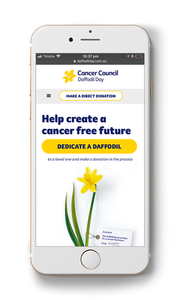
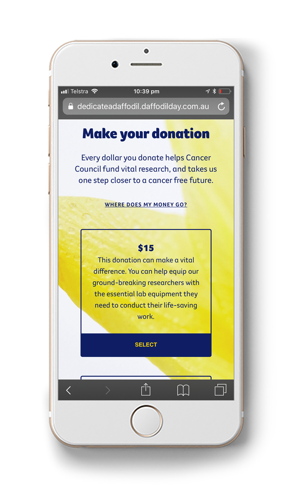
The website needed to be designed and built for use on both desktop and mobile. Our analytics indicate that the main Cancer Council website is used 51% of the time on a mobile device, meaning all of our products need to function equally well on mobile and desktop. The above mock-ups show how the design responds to different devises.


Comments